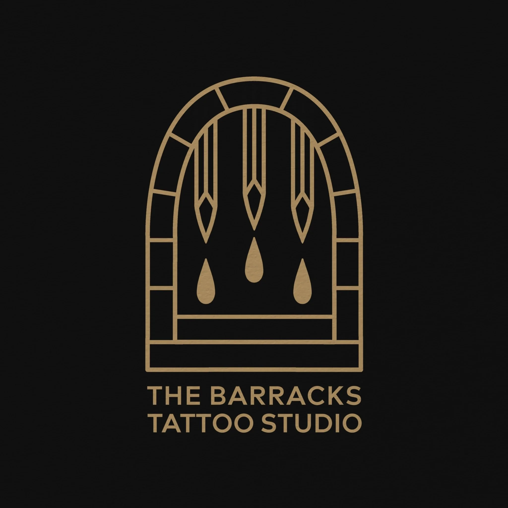
The Rebrand
For the last couple of months I’ve been thinking about rebranding and creating a new visual identity for the shop, our old logo was created in-between decorating and getting the premises ready after lockdown. After not working for so long a logo was the last thing on my mind but we needed something to help build brand recognition going forward so we settled.
As many of you know we are situated in a historic ex military barracks in the heart of Newcastle under Lyme, the main entrance to the building being a large archway, ‘through the arch’ becoming our unofficial slogan for letting our clients know where we are. The archway became a very obvious symbol to begin working with when thinking about our new identity. I also wanted to play with the idea of the barracks being an impenetrable fortress, symbolising strength I created a gateway of daggers, which also suggest tattoo needles or pencils representing the creative process. The droplets were added to further cement the idea, representing the ink, sweat and tears that we put into our work.
I believe we come to strong visual representation for everything we stand for at The Barracks Tattoo Studio, tough, hard working creatives, striving to do our best for the community, providing a safe space for all without judgment.
A massive thanks to all that brace our doors and keep us doing what we love doing, we couldn’t do it without you.
All the best, The Barracks Team,
Kyle, George & Elliott

